
Press & Brand
Brand kit and design principles.
Logo, colours, typeface and the reasons behind each decision – for journalists, partners and anyone who wants to present the Blockfinance AG name correctly. All files are in the brand kit (ZIP).
Boilerplate
For editorial use.
Blockfinance AG is a technology and holding company based in Gamprin-Bendern, Principality of Liechtenstein. The company operates its own IT infrastructure, offers off-site backup and IT security services "made in Liechtenstein", and advises companies on the commercial implementation of blockchain projects in the European market. Its corporate purpose also covers software development, AI implementation under the EU AI Act, software trading and internet services, as well as trade in rough and semi-precious stones. The group is represented through holdings in Germany and Spain.
Press contact: info@blockfinance.li · +423 340 08 08
Logo
Nine blocks, one lattice.
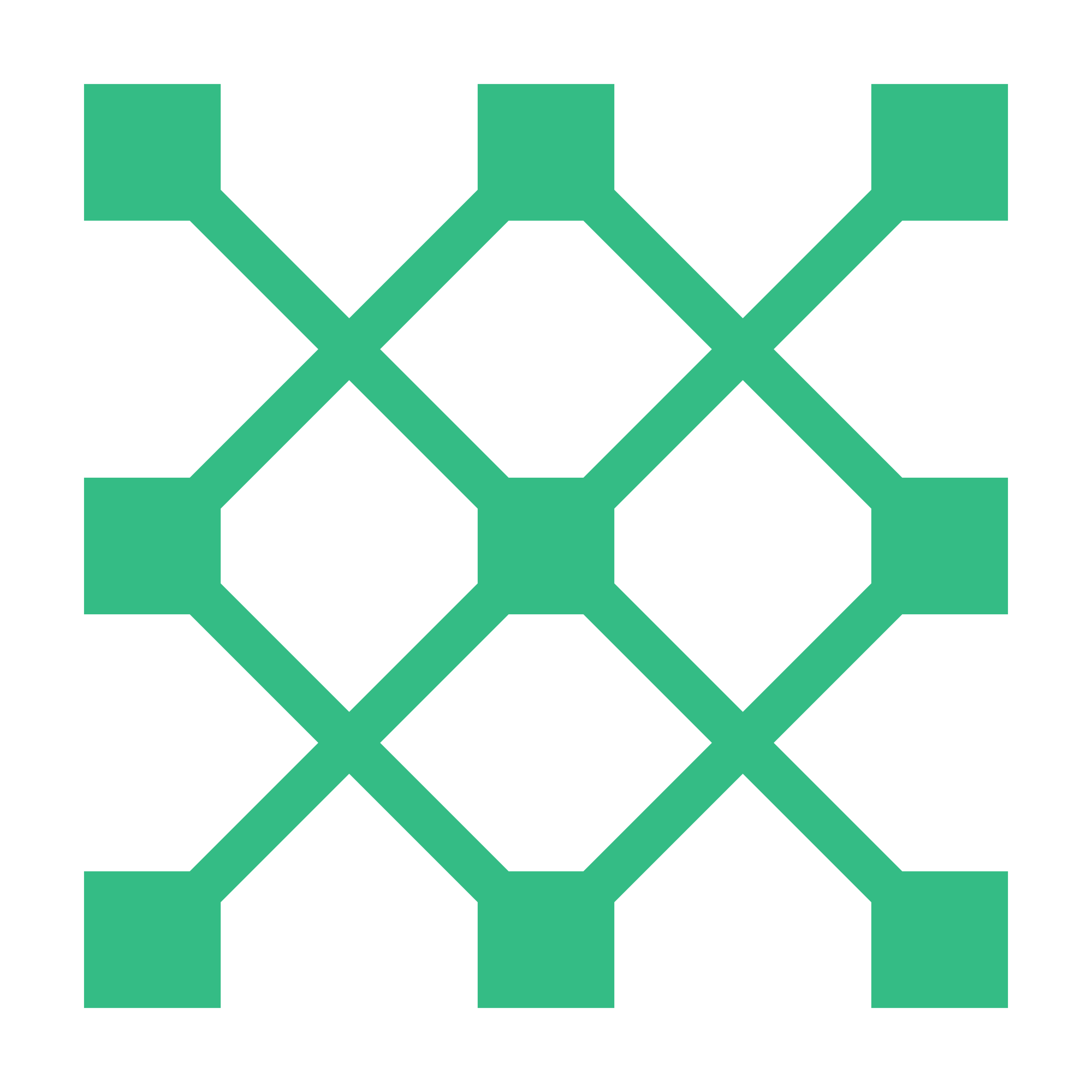
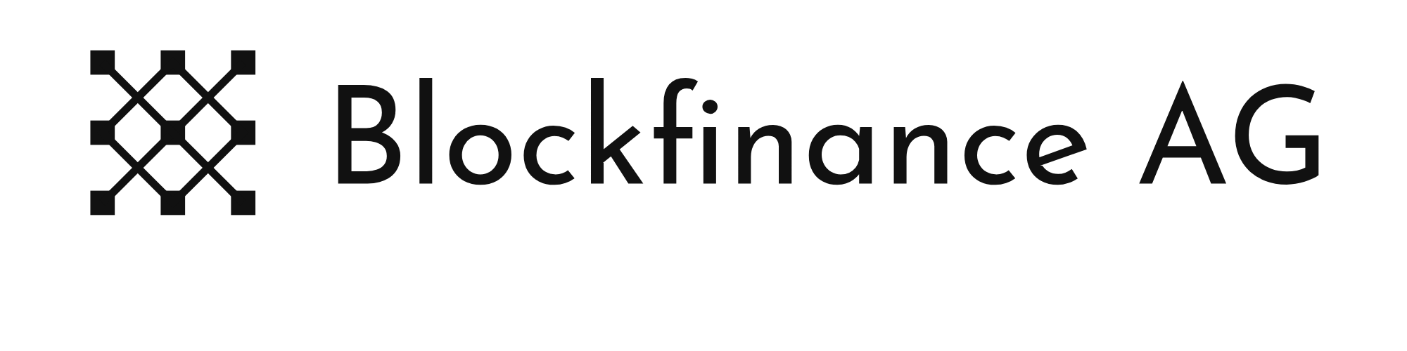
The mark consists of nine squares joined by a diagonal lattice. It is deliberately abstract: as a parent company with several lines of business, Blockfinance AG needed no picture from a single industry but a strong form that is recognised as a signet.
The form joins two ideas. The connected squares stand for the blocks of a chain – blockchain and IT. The lattice recalls the locking bars of a vault door – security and custody. Together they make a mark that shows technology and trust in one figure.
The lattice can be reconnected: the same nine squares yield marks for subsidiaries and products. The family stays recognisable without every unit carrying the same logo.




Usage rules
- Clear space around the logo: at least the height of one square of the signet.
- Minimum size of the wordmark: 24 mm wide in print, 120 pixels on screen; the signet alone from 16 pixels.
- Colour only on white or on the brand's deep green; on all other surfaces single-colour black or white.
- Wordmark and signet are not separated and recombined, not rotated, not distorted.
- No gradients, shadows, outlines or effects; no change to the green.
- No claims, slogans or third-party logos inside the clear space.
Colours
Green instead of corporate blue.
The brand colour is a clear, cool green. Choosing it was a decision against the blue that dominates finance and IT: green stands for calm and reliability – the feeling a client should have when their data and projects are with us – and sets Blockfinance AG visibly apart from the field of competitors.
A deep blue-green serves as the counterpart for surfaces and headings; black and white carry text and calm. The green is used sparingly: for the signet, for accents, never for whole areas of text.
The orange in the group's colour system identifies a subsidiary and is not used for Blockfinance AG.
Typeface
Josefin Sans for the brand, Source Sans 3 for the text.
Josefin Sans is the typeface of the wordmark and all headings. It is geometric, inspired by the typefaces of the 1920s, and its open curves match the clear form of the signet. It is open source (SIL Open Font License) and may be used by partners for brand materials without licence fees.
Source Sans 3 carries the body text on the website. Josefin Sans has a low x-height and reads poorly in long paragraphs; Source Sans 3 was designed for screens and user interfaces, has tabular figures for tables and is open source as well. Both typefaces are served from our own servers – no fonts are loaded from third parties.
Blockfinance AG
Josefin Sans 300 · 600
Source Sans 3 – body text stays calm and legible, including long compound words such as configuration management or restorability test. Figures: 0123456789 · CHF 1'234.50
Website
Why this website is built this way.
No tracking, no third-party services
The site sets no cookies and loads no external fonts, scripts or maps. What a security provider asks of its clients applies to itself first.
HTML and CSS only
No server-side programs, no database, no JavaScript. A small attack surface, fast loading, and pages that will still be readable in ten years.
Calm instead of effects
The presentation is light and clear: paper with a hint of green, generous white space, a quiet hierarchy. Nothing blinks, nothing follows the visitor.
The lattice as the only ornament
On the home page the signet is assembled block by block; elsewhere the 3×3 grid appears only as a small marker. No stock images, no gradients, no effects.